Cafe Olè Package
Cafe Olé by H‑E‑B® Texas Pecan Cold Brew Coffee Packs are convenient and easy to use– no grinding beans, no coffee maker needed and will steep overnight. The 12 hour cold steeping process results in delicious and smooth coffee and like all Café Ole products, the Cold Brew packets are made with high quality Arabica coffee beans.

Final Design
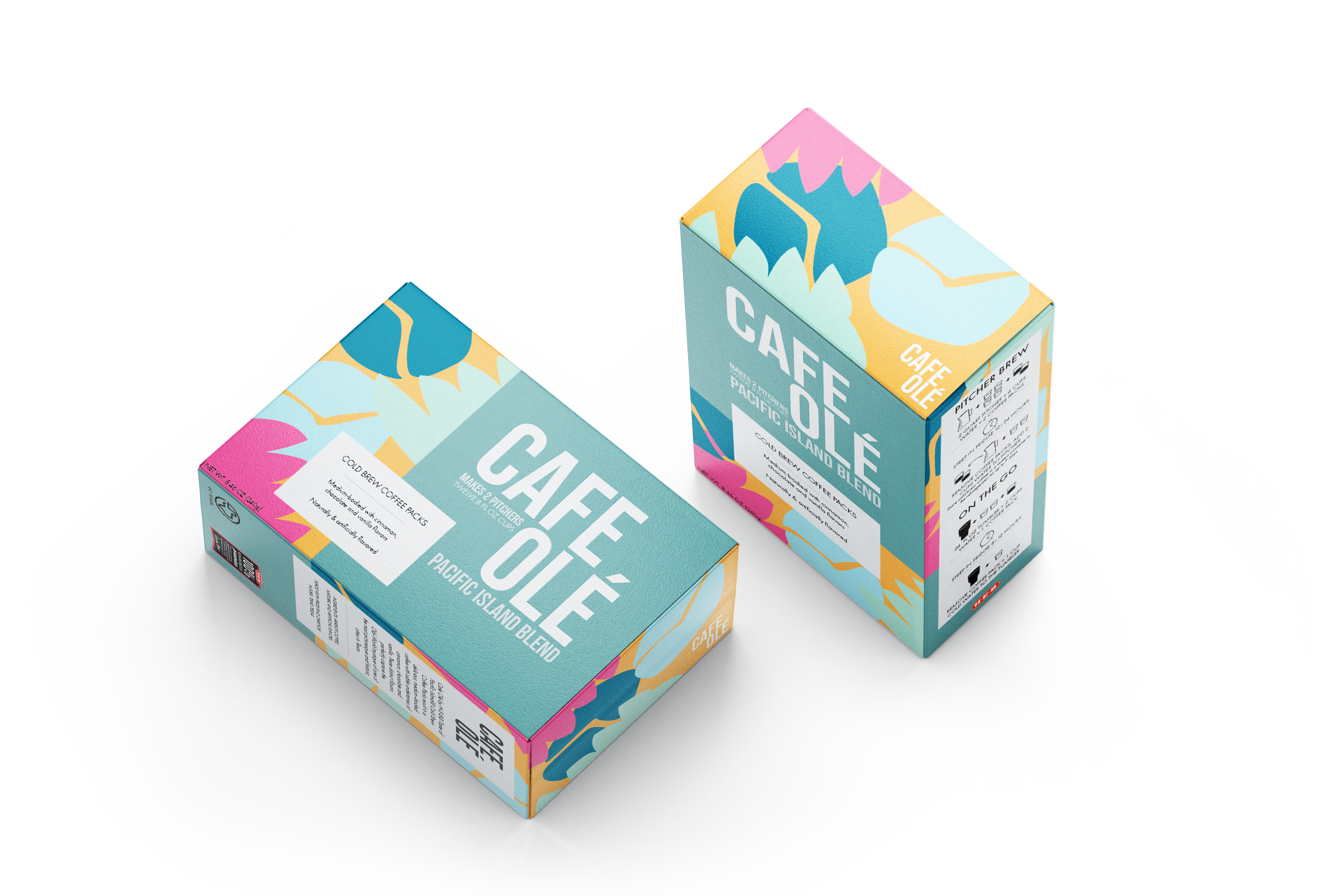
This 8in x 5.5in x 3in package is an improved version of the original Cafe Olé package design. By using hard edges, sharp corners, large type, and bright colors, I was able to transform the original dull package into something that comes to life on store shelves. The coffee bean and leaf illustrations in the background provide an indication that the ingredients used are natural while the bright colors and clean typography gives the consumer a sense of a new/modern design that would intrigue them to try the product.
Dieline
Typography
Subheading: Bebas Neue regular
Body Copy: Futura PT light
Colors
Challenge
The objective of this project was to re-create a six-sided package with a focus on typography, color, and overall layout. The challenge here was designing for something that must compete with its competitors, like Starbucks & Dunkin’, when seen on the shelves at H-E-B® . I also needed to keep note of the previous H-E-B® design in order to distinguish which design elements were needed or unnecessary.
Target Audience
The target audience consists of cold-coffee drinkers. Whether it be young students looking for a cheaper alternative at the grocery store or a working adult that can’t resist H-E-B®’s low prices, the improved design should grab their attention and have them consider switching over to Cafe Olé.
Deliverables
Package Design (six-sided box)
Research & Inspiration
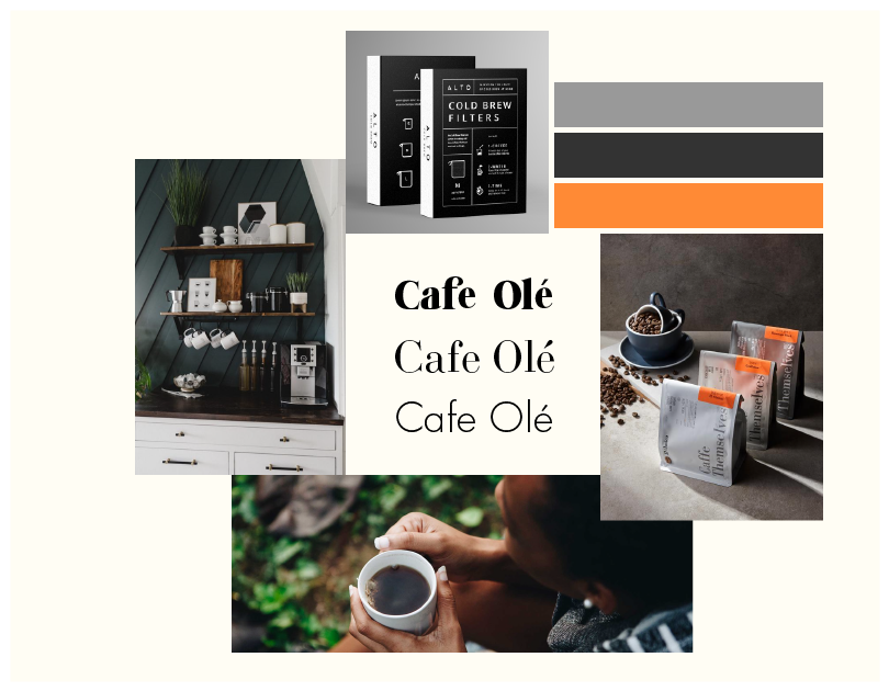
I collected images and examples of good package design as well as the competitors package design to figure out which direction I first wanted to move towards. There were many different styles I could have decided on but ultimately choosing between these two mood boards was my final step before designing. I ended up moving forward with the fun/colorful mood board on the left in order for the package to really pop out when seen in the aisle of a grocery store.
Sketches
These were the earliest stages of my sketches. I was initially trying to figure out how I wanted the layout of the type and also what kind of graphics/illustrations I wanted to include. I started to notice a lot of my sketches included large type and I began to realize how captivating and interesting the design could be if I continued exploring that option.
Drafts
My first drafts consisted of three different options. With the help of my classmates and professor, I had gotten a lot of great feedback and came to the decision that the middle option was more dynamic and visually interesting than the other designs. I continued to tweak the graphics and color until I finally landed on a design that I could take elements from and apply them to other sides of the box.
Reflection
This project was extremely gratifying for me especially because of my passion for package design. Cafe Olé is a product that I buy frequently so it was really interesting to visually strip down the design and start over again. I would like to continue this project by making a series for Cafe Olé and create other variations for the different flavors they provide.
*This design was for a school project and not for actual use


