The Great Gatsby Cover
The Great Gatsby is a novel by F. Scott Fitzgerald that was published in 1925. Set in the Roaring Twenties, it tells the story of Jay Gatsby, a wealthy and mysterious millionaire, and his romantic pursuit of Daisy Buchanan. Through the eyes of Nick Carraway, a young man who becomes friends with Gatsby, the novel explores themes of love, wealth, class, and corruption. Its intricate plot and characters have made it a classic of American literature.

Final Design
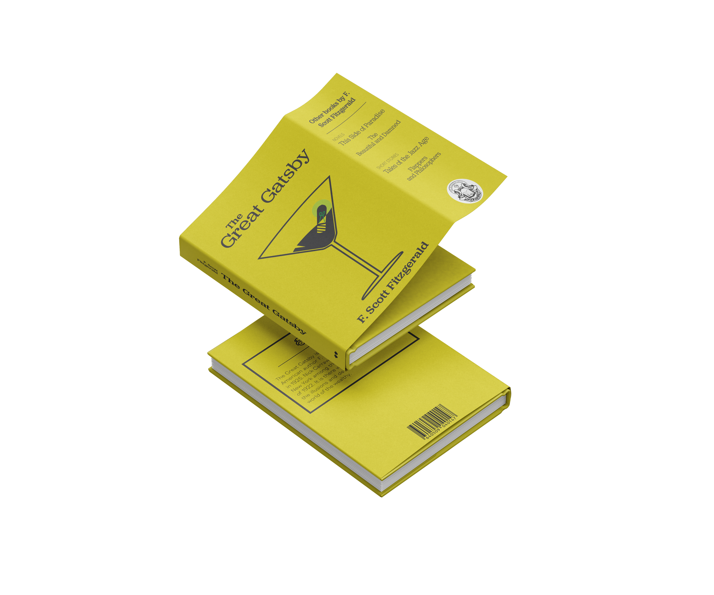
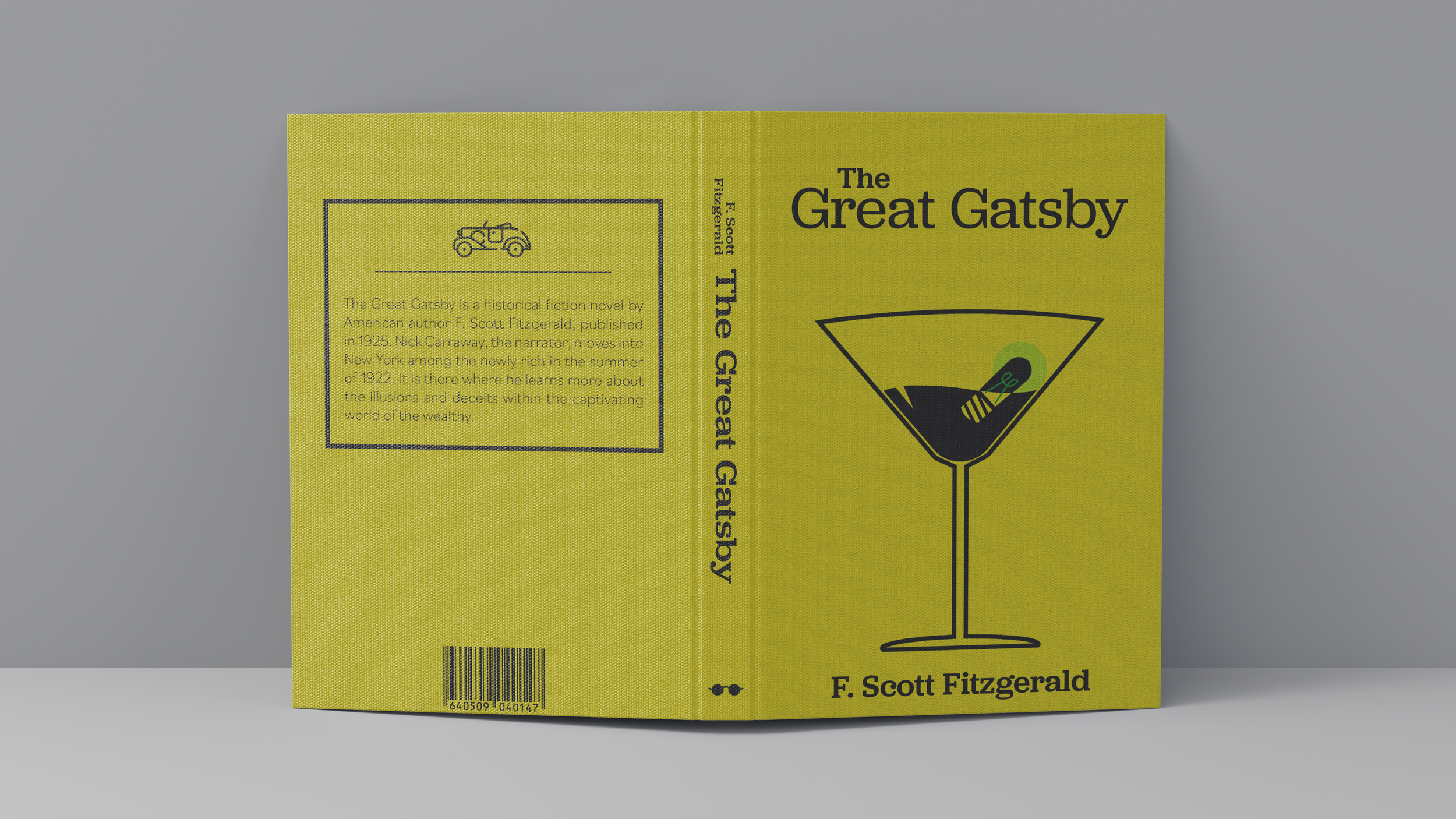
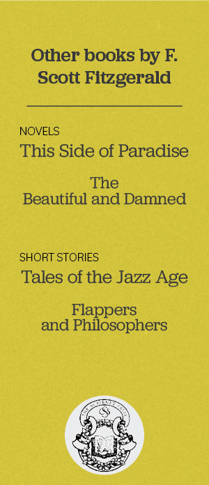
Using a minimalistic approach, this book cover was made to bring a new look to the already existing covers of The Great Gatsby. The design showcases many forms of symbolism referenced in the story, an excerpt about the author, and a list of other books written by the author, F. Scott Fitzgerald.
The symbolism referenced:
Martini glass (front cover): Jay Gatsby acquired his wealth from selling alcohol during prohibition and threw large parties in which alcohol was always present.
Green Light (front cover): The green light at the end of Daisy’s dock symbolizes Gatsby’s dream and hopes. It represents both dreams of American society and Gatsby’s single-minded goal of winning Daisy’s love.
Yellow Car (back cover): Gatsby’s flashy yellow car plays a critical role in the conclusion of The Great Gatsby, as it ultimately leads to Jay Gatsby’s own death and the deaths of Myrtle and George Wilson.
Glasses (spine): The eyes of Doctor T. J. Eckleburg are a pair of fading eyes behind a pair of glasses that is painted on an old advertising billboard over the valley of ashes and is pointed out by the narrator multiple times in the story.
The Color Yellow: Yellow is the most common color that appears in the novel. It symbolizes money, materialism and high social position, but can also symbolize luxury and greed.
Typography
Heading: Jubilat medium
Body Copy: Bilo extralight
Colors
Challenge
Designing a book cover for a novel that already has plenty of existing covers, is already challenging in its own way. The cover needed to reflect the self-indulgence and glamour of the roaring twenties, while also conveying the tragedy that underlines the narrative. Balancing these elements, I needed to create a visually striking image that will attract readers and stand out among the countless editions of this classic story.
Target Audience
The target audience for The Great Gatsby is primarily adults. While it has a broad appeal, it is not typically recommended for younger readers due to its mature themes and content. The novel is often studied in academic settings, making it particularly popular among students. Additionally, fans of early 20th century period novels and stories about the glamorous lifestyles of the wealthy may also enjoy The Great Gatsby.
Deliverables
Book Cover (front & back cover, spine, inside flaps)
Research & Inspiration
First I read the book again in order to better understand the story and to keep the imagery fresh in my mind while designing. I then collected some of my favorite existing book covers of The Great Gatsby and its competition during its time of release. Lastly, I created some moodboards to get a better feel for the vision I had of the book cover. I came to the conclusion that the art deco and glamorous style of the first moodboard had more of an appeal and related more to the story than the other dark and mysterious moodboard I created.
Sketches
When sketching the covers, I focused on the question, “How can I grab the readers attention while still relating the content to the story?” This wasn’t an easy task but there were so many ideas that came to mind as to how I could incorporate imagery and symbolism from the story and turn it into something eye-catching.
Drafts
After narrowing down which eye-catching piece would display on the front cover, I created some digital drafts to get a better feel on which design might work best for representing the book and how that design would incline the reader to open it. I continued to work on the martini glass draft to clean up the design and edited the negative space in the light bulb so that the color wouldn’t clash with the yellow background.
Reflection
The Great Gatsby is one of my favorite books and it was a pleasure to design my own version of the book cover. It’s so interesting to see the symbolism in the story brought to life and spread out across the design. Using the experience I had from this project, I am eager to design another book cover in the future.
*This design was for a school project and not for actual use


