Design Hero Booklet
Josef Müller-Brockmann was a Swiss graphic designer, author, and educator that was a pioneer of the international typographic style. Also known as “The Grandfather of Swiss Design,” his designs and use of type inspired many designers’ work and still do to this day. In this informational booklet about Josef, it reads briefly about his history, his influence, and the structure of his design while showcasing his work in a way that reflects his own style.

Final Design
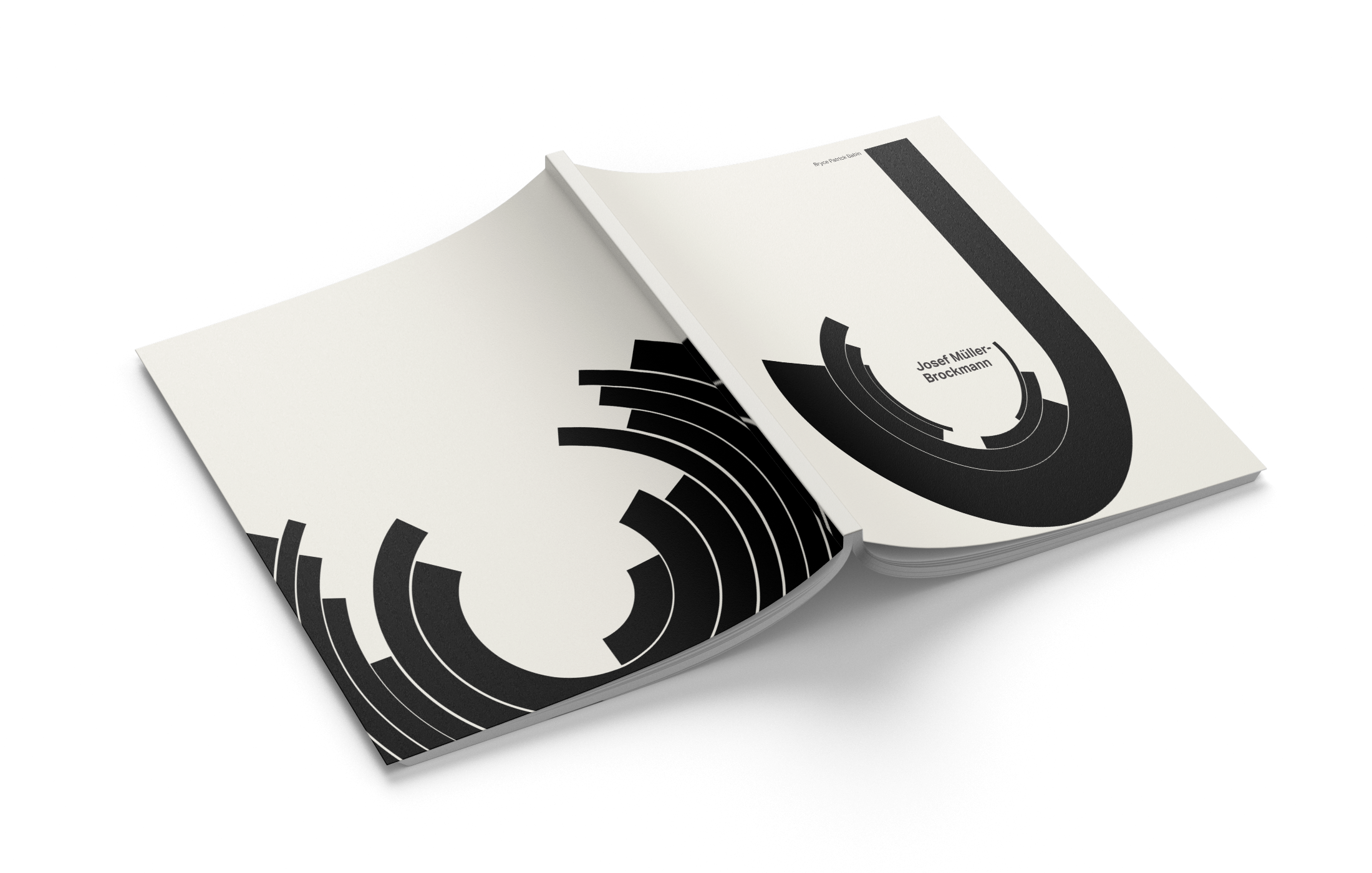
When implementing a sense of minimalism, type on a grid, and a sans-serif typeface, someone can be quick to identify the swiss design style of Josef Müller-Brockmann. While designing for this 16-page booklet about JMB, I wanted to show how much I learned about type and Swiss design and to prove its influence to any reader that has a fascination for design or typography.
Front Cover
Back Cover
Typography
Subheading: Aktiv Grotesk bold
Body Copy: Aktiv Grotesk regular
Colors
Challenge
I was tasked with designing a sixteen page booklet about my design hero, Josef Müller-Brockmann. The goal was to provide a clear understanding of the content, detail-oriented type on a grid, and to match the design style of Josef Müller-Brockmann. When designing each spread, I needed to recognize the cohesiveness of the project as a whole and make sure each spread was in a similar style so that each page looks as if they’re related.
Target Audience
This design booklet would be especially relevant to people who are interested in Swiss design, typography, and minimalism. It would also be useful for people who are studying graphic design history or who want to learn more about the work of influential designers.
Deliverables
16-page booklet (inner layout as well as front & back covers)
Research & Inspiration
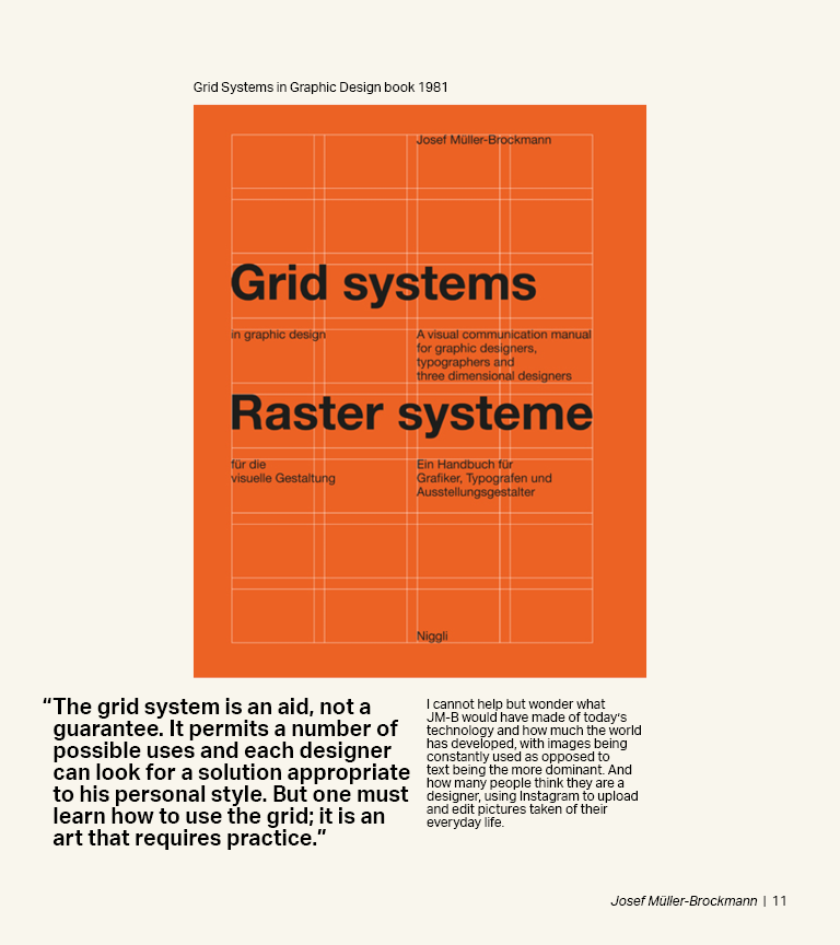
I researched many of Josef Müller-Brockmann’s designs as well as other designers that made use of unordinary type on a grid. I needed to collect as many references as I could in order to get a good grasp on how to properly use the grid in a way that payed homage to his designs.
Sketches
When sketching, I made sure to keep in mind the sophisticated grid and large scale geometric shapes that Josef Müller-Brockmann uses in his designs. I referenced his past work and was able to input my own design choices in order to clearly establish how the content should be viewed.
Reflection
After sketching out many different spreads, I had enough reference material to move onto InDesign and start designing the booklet digitally. Thanks to my professor and classmates, I was able to get feedback on which spreads were working best and continued to tweak minor details until all of the pages were cohesive while still maintaining JMB’s aesthetic.
*This design was for a school project and not for actual use


